Britannia Collection
Britannia is not just a collection of wallpaper - it is an aesthetic statement articulated in the language of British nobility, a contemporary reinterpretation of the visual codes cultivated for centuries in the great houses of England. It is, in essence, a living ornamental archive in which each pattern evokes a name, a place, an era and an idea of beauty filtered through education, rank and cultural memory.
This collection is not designed to illustrate. It is designed to speak. Each wallpaper becomes a voice that speaks a fragment of a larger story - the story of a nation that has embedded its values not just in architecture or literature, but in the subtle fabric of interiors. With Britannia Unchained, we have chosen to transpose these values onto the walls - where they are mirrored, sedimented and become part of the inhabited space.
Visually codifying an ordered world
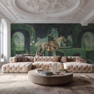
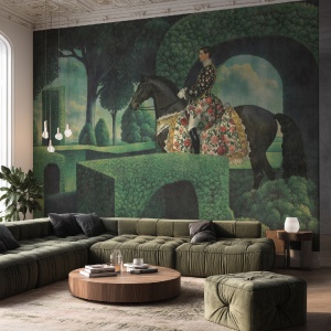
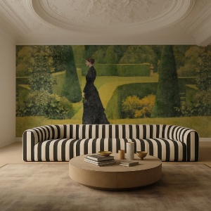
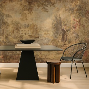
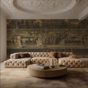
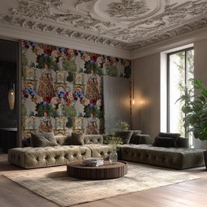
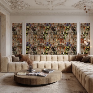
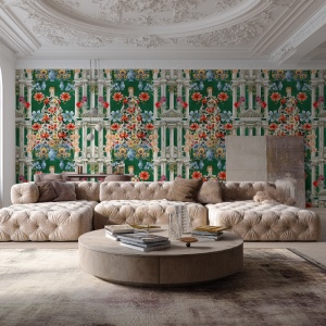
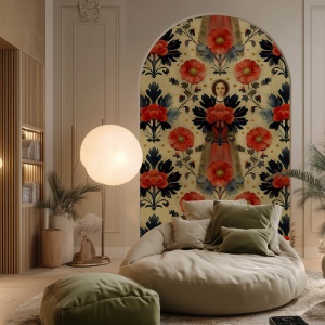
Each pattern in the collection is inspired by a central element of aristocratic British imagery: either a historical or fictional female figure, a legendary place or a cultural symbol. From the geometric solemnity of the Round Table wallpaper - which borrows from the heraldic rigour and symmetry of chivalry - to the lyrical sensuality of the flowers in Ophelia's Veil, the entire collection maintains a logic of visual construction based on balance, repetition and allusion.
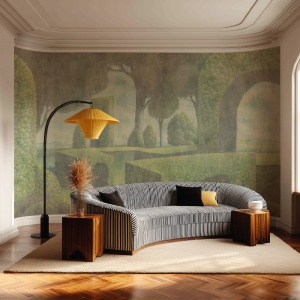
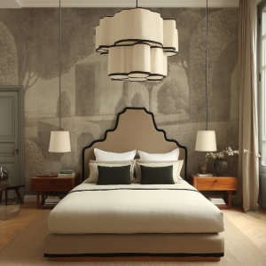
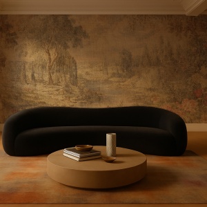
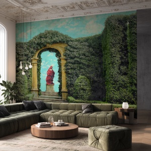
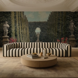
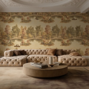
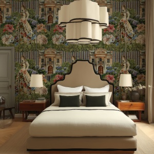
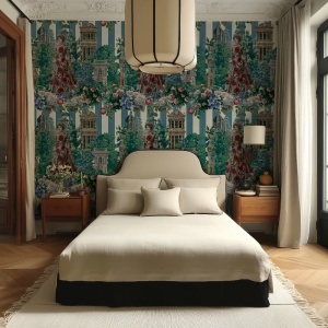
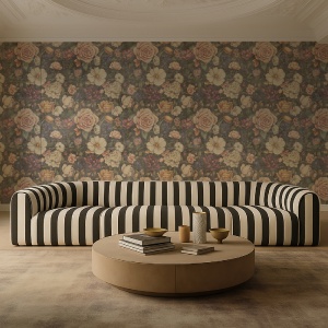
The designs range from airy botanical compositions inspired by royal gardens and the illustrative aesthetics of the Victorian era (Foxglove, Rosemead, Everly Garden) to rigid, symbolic structures with strong graphic accents (The Viscount, Hollow Crown, Velvet Reign). This ornamental spectrum is, however, unitary in the tone it maintains: one of restraint, elegance and cultural depth.
There is discipline in the construction of each pattern - not rigidity, but a clear awareness of proportion. The tapestries are not merely decorative backgrounds, but codified surfaces, in which each repeated form refers to a refined life practice: the knowledge of flowers, family heraldry, social etiquette, restrained gesture. Everything becomes visible and yet preserved in a certain intimacy, just as in classic British interiors.
Colour palette - a subtle history of tone
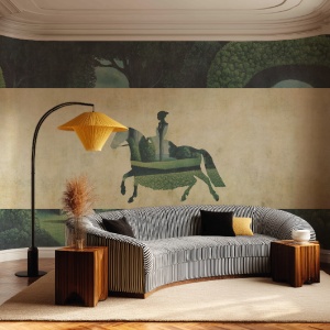
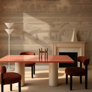
The colour palette of the collection is also tributary to a certain kind of visual education. The tones are warm, subdued, natural - ochres, earthy greens, faded pinks, shades of cream, blue-grey or matt browns. Nothing is garish. Nothing is obvious. Each shade seems chosen not to dominate the space, but to balance the light, the furniture, the atmosphere. The colour palette does not follow trends, but evokes moods, emotional seasons, rooms filled with memories.
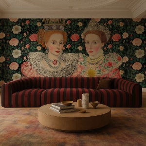
There are saturated and dramatic versions - Velvet Reign Dark, Empire Bloom (Indigo), Round Table (Red) - where colour becomes an aesthetic armour. But there are also faded interpretations that seem to float on the surface like a visual memory - Rosemead Faded, Ophelia's Veil (Cream). Between these two extremes, the collection proposes not just options but inner states. Chromatics here become a tool of decorative psychology, where the walls actively participate in the atmosphere of the room.
Women, heritage and personal spaces
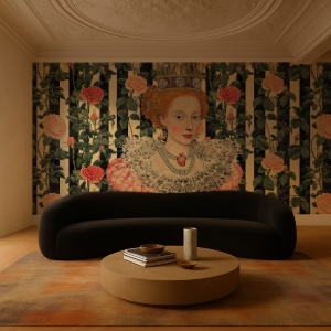
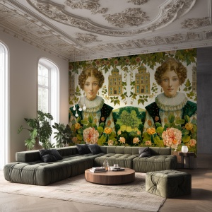
An important part of the collection is made up of models bearing feminine names - Lady Diana Spencer, Lady Emily, The Lennox Sisters, Lady Sarah Chatto, Lady Helen Taylor, Lady Amelia Windsor. These are not portraits, nor historical reproductions, but graphic interpretations of an aristocratic female ethos: complex, cultured, sometimes contradictory, but always self-conscious.
Each of these designs strikes a balance between delicacy and strength. Lady Mary Crawley brings a sober, slightly neoclassical elegance. Lady Antonia Fraser is an intellectual composition with clear historical detail. Lady Charlotte speaks of grace enclosed in geometric structures, and Lady Amelia Windsor visually translates a modern femininity rooted in a taste for floral drama.
This series offers a decorative perspective on the feminine role in aristocratic British culture: the woman as the keeper of ritual, the aesthetic binder of the home, the figure of memory and moderation.
Memory, not nostalgia
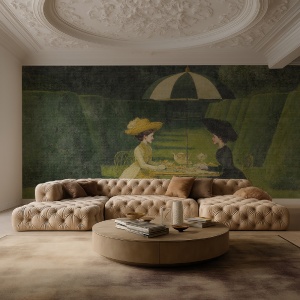
Britannia Unchained is not a nostalgic collection. It does not seek to revive a museum aesthetic or to redecorate in a historicist manner. Instead, it is a collection that understands the power of cultural memory and reformulates it in contemporary language. The tapestries do not reproduce, but reinterpret. The designs are not vintage, but built on a conceptual grid that assimilates the past and transforms it into an elegantly lived present.
This is active memory - a way of bringing something of the gravitas, beauty and order of the aristocratic British world into the domestic space. A wall decorated with a pattern from Britannia Unchained not only beautifies, it transforms: it gives rhythm to the room, sets the tone of a conversation, gives gestures a certain slowness, a certain verticality.
Space as an extension of character
In the spirit of the highest British decorative traditions, the Britannia Unchained collection proposes wallpaper not as a decorative visual accent, but as a total atmosphere. Not as a mere embellishment of the walls, but as a subtle form of self-portrait - a reflection of the interior not just physically, but psychologically and culturally. Just as a carefully composed bookcase or a carefully chosen piece of clothing says something profound about its possessor, so a wallpaper pattern becomes a visual clue to an assumed identity, a well-defined sensibility.
In this vision, décor ceases to be background - it becomes discourse. Each chromatic choice, each ornamental line, each graphic repetition says something about the values of the person who inhabits it: the inclination towards order or dreaming, the attachment to tradition or the courage to reinterpret. The tapestries in this collection do not embellish rooms as decorative accessories, but transform them into aesthetic statements. And these statements are not banal or transient - they are articulate, well thought out, sometimes poetic, sometimes austere, but always clear.
Britannia Unchained is not a collection that seeks to please everyone. It does not flatter. It does not follow trends. It is for those who understand nuance - not just in colour, but in meaning. Those who look with respect at visual history, not as a succession of styles, but as a continuous line of thought, in which every ornament, every floral motif, every geometric alignment has a genealogy. It is a collection for those who see in the wall a space for silent dialogue between themselves and the world.
In an age in which the home tends to become a stage for exhibition, Britannia Unchained proposes the opposite: the home as a cultivated refuge, as a natural extension of the personality, as an internalised gesture rooted in memory, education and sensitivity. Each wallpaper in this collection, after all, calls for a careful type of inhabitant - someone who knows their tastes not by impulse but by conviction; who understands that living is not just about furnishing, but about expressing.
These are designs that require patience, patience and a willingness to nuance. They are not intended for hurried glances or the rapid consumption of images, but for the eye that knows how to look for rhythm, harmonic repetition, the subtlety of controlled asymmetry. In this respect, the collection is closer to a classical musical repertoire than to a gallery of samples: each model must be listened to, understood and felt in its context.
Just as an inherited piece of furniture tells a story, just as an annotated book reveals a reader's thoughts, so a wall decorated with The Viscount, Ophelia's Veil or Empire Bloom says something about its inhabitant - about the way he or she looks at the world, lives his or her intimacy, constructs his or her daily rituals. In this sense, the collection is more than an aesthetic offering: it is a form of personal curatorship, an exercise in definition by choice.
Through this approach, Britannia Unchained re-establishes the relationship between interior and identity. It is not a collection of wallpaper. It is a collection of visual forms we choose to live with - and that choice inevitably becomes a reflection of how we understand ourselves.